Imitation – the sincerest form of flattery?

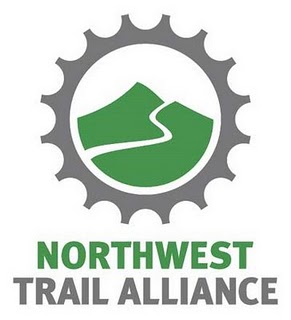
NW Trail Alliance logo

This week, PUMP (Portland United Mountain Pedalers) unveiled a new name and logo for the mountain bike advocacy organization. The new name, Northwest Trail Alliance, sounds flat and uninspiring compared to PUMP.

The new logo, however, is what’s really unoriginal. When you borrow another organization’s logo, that’s not called rebranding. Let’s call it copybranding.

Seattle’s Backcountry Bicycle Trails Club recently rebranded and chose a controversial name– Evergreen Mountain Bike Alliance. Did Kris Schamp (former marketing specialist for Bike Gallery) unconsciously, or consciously, misappropriate the logo (below) that BBTC had used for over ten years?
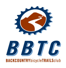
Backcountry Bicycle Trails Club logo
The recently retired BBTC logo was created by Ross Cattelan, a long-time BBTC supporter and professional graphic designer. After I developed a concept with another designer, Ross added depth to the imagery and he created a new color palette that was used across all BBTC marketing materials (until last year when BBTC evolved to Evergreen).

Legally, Northwest Trail Alliance is not in danger of trademark violation. Its new design deviates significantly enough from the BBTC logo that it is probably not “confusingly similar.”

When determining infringement, the Court considers the following elements:

  1. Strength of the mark
  2. Proximity of the goods
  3. Similarity of the marks
  4. Evidence of actual confusion
  5. Marketing channels used
  6. Type of goods and the degree of care likely to be exercised by the purchaser
  7. Defendant’s intent in selecting the mark
  8. Likelihood of expansion of the product lines

A little market research and common courtesy can help ward off trademark suits.
Color Communicates

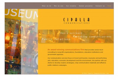
screenshot Cipalla Communications website

Project: New Website
Client: Cipalla Communications
CSS/XHTML Development: Marketing By Marlow

Even communicators must communicate. Rita Cipalla launches Cipalla.com.

  • “Your site looks great, very professional, easy to navigate.”
  • “I love the web site. Very cool– very crisp!”
  • “The vibrancy of color, the content of your test, your graphics,everything is TOP-NOTCH….just outstanding! So professional yet warm and engaging.”
  • “Very impressive website. I quickly and easily, with interest, viewed the whole thing. Very professional, to the point, and logical.”
  • “I like the feel and look of it. It says a lot without feeling heavy.”
  • “I checked your website. My, oh, my, it’s lovely. I felt like I was floating through the background images — very ethereal. The colors are great.”

“Scott was so easy to work with. He was thoughtful, good-natured and ever-so-patient with the many tweaks and edits that I made to my web site during the HTML design phase. He willingly considered each of my requests, regardless of how small, and was honest in his assessment and recommendation. I’m very pleased with how my site turned out, and I continue to get great feedback on it.”
Rita Cipalla, president
Cipalla Communications

Graphic design by Barbara Hartinger of Poetica Design

Emotional Branding

In an out-of-control world it is the most human instinct of all to want to be able to impact our immediate surroundings with things of beauty and originality: This gives us a sense of control…Finding an element of human touch reconnects us to what’s real.

from Emotional Branding by Marc Gobé.

Bank of America(n Drivers)

I generally don’t expect much customer service from banks. I should expect much less from Bank of America.

My former landlord just sent me a rental deposit refund drawn on his bank, Bank of America. Because the check was made out to me and my girlfriend, who don’t own a joint account, I visited the local West Seattle BOA branch on Alaska to cash the check.

I was informed there would be a $6 “convenience charge” for me to cash the check. That’s not very convenient; that’s outrageous.

Two employees intervened that this fee is typical. Well, it is NOT typical. I called my financial institution, Verity Credit Union, which confirmed that, indeed, they would cash any check drawn from Verity for a non-Verity customer…for NO FEE!

Of course, I was already in a bad mood since the morning-shift teller turned me away at the drive-thru because I was riding a bicycle (the drive-thru opens one hour earlier than the branch, but apparently is open only to car-driving BOA customers). Sorry bicyclists and pedestrians.

Bank of America drives away customers while serving drivers only.

Change of Address

Worldwide Corporate HQ for Marketing By Marlow has relocated from Ballard, Washington to West Seattle

Officially known as “Fairmount Springs,” our new neighborhood is known more by its proximity to Morgan Junction, and perhaps Beveridge Place Pub, our new favorite drinking establishment.

According to 2000 U.S. Census data:

  • Median age of our neighbors is 40
  • Average household size is 2
  • Median household income is $49,338
  • 82% of our neighbors live in homes without children
  • 50.5% are married; 27.9% are single; 14.9% are divorced; and 6.7% are widowed
  • 60% of residents own their homes, while 35% rent (5% are unoccupied)
  • 80% of the workforce is white collar; 20% is blue collar

We’d like to thank our real estate attorney, Scott Scher, and professional appraiser, Dave Watkins, who assisted us in representing ourselves as buyers. We chose NOT to finance through Countrywide – opting instead for our local nonprofit financial institution, Verity Credit Union.

You can reach us at the same land line, provided conveniently by Comcast.